
Note: This is part three of a three part series. If you have not yet read parts one and two, please click here to read part one or here to read part two before continuing.
Hopefully Part 1 and Part 2 of this blog series have allowed you to understand the RCI and RTI metrics and the benefits of these metrics. Now lets explore how to present and visualize this valuable information.
We have all heard the phrase “a picture is worth a thousand words”. I often use a whiteboard when trying to explain a new concept or technical material to someone. Paul Martin Lester, Professor of Communications at California State University at Fullerton, states “Something is happening. We are becoming a visually mediated society. For many, understanding of the world is being accomplished, not through words, but by reading images”. I believe this is especially true when large amounts of complex, technical information needs to be conveyed in a quick and concise way. The RCI and RTI metrics take a complex (and many times large) set of information and communicates the state of cooling compliance and airflow balance in the data center. Nothing about this is simple – it is all complicated and the larger the scale, the greater the complexity. Make sure whatever software system you select for RCI and RTI metrics, has the ability to convey the information concisely and graphically in various ways.
RF Code’s Asset Manager (AM) & Sensor Manager (SM) software can compute and display the RCI and RTI metrics in a variety of different ways with different types of contextual information.
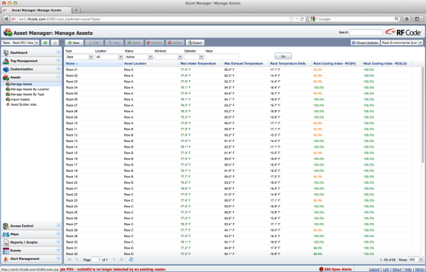 In the view above, Asset Manager is using a simple table view to display each rack with select attributes in the columns including the RCI metrics. This is simple and straightforward but quickly becomes ineffective when the number of racks is larger than the number of rows that can displayed without scrolling.
If a table view is desired, then the use of Asset Manager’s filtered table view would be more effective.
 Figure 2 above illustrates how to use Asset Manager’s filter control to limit the information displayed in the table view. In this example, the attribute “Rack Cooling Index – Hi” is the selected attribute and only rows with a value of 96% or less will be displayed.
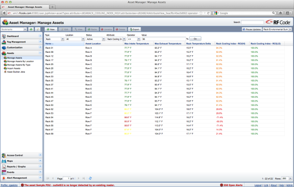 Through the use of the filter, Figure 3 shows a much more usable view where only exception conditions are shown. In this example the normal conditions are ignored or hidden revealing only the RCIHI conditions that are of concern. Now imagine if the view using the same filter resulted in a blank screen indicating all conditions are normal. This type of exception-based views provides a quick way for operators to understand issues and focuses attention on problem areas.
Graphical map views of a data center are very popular today. A very powerful way to display relevant information is to overlay values on top of the physical layout (image) of the data center.
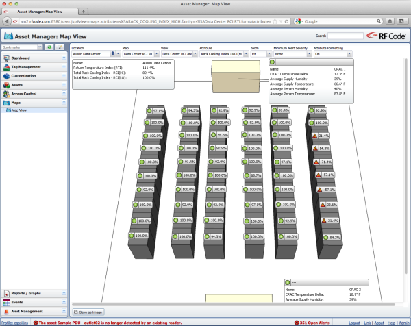 In Figure 4 above, the RCIHI value has been overlayed on top of the physical rack layout image. In addition to the value of RCIHI, the values are color and shape coded to indicate normal vs. exception conditions. This is a perfect view to display in a data center NOC allowing operators to easily understand actual thermal conditions as compared to the desired thermal conditions.
Some data centers are too large to display on a single screen as there are just too many racks and rows of racks. If this is case, then multiple map views may have to be created to show rack views in sections on multiple screens simultaneously. An alternative is to roll-up or summarize the information to the next level of the hierarchy such as the row.
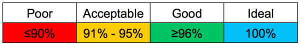
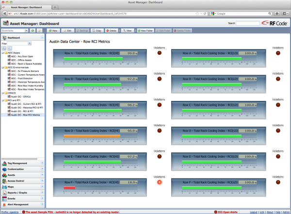 In the illustration above, Asset Manager’s Dashboard view is utilized to display the Total RCIHI (left column) and Total RCILO (right column) for each row. Using the horizontal bar widget which is color coded according to the categorized ranges of the RCI metric, a very simple yet powerful view is created indicating which rows are good, which rows are acceptable and which rows are poor.
 Finally it is also possible with Asset Manger to display three simple indicators (RCIHI, RCILO, and RTI) for the entire data center.
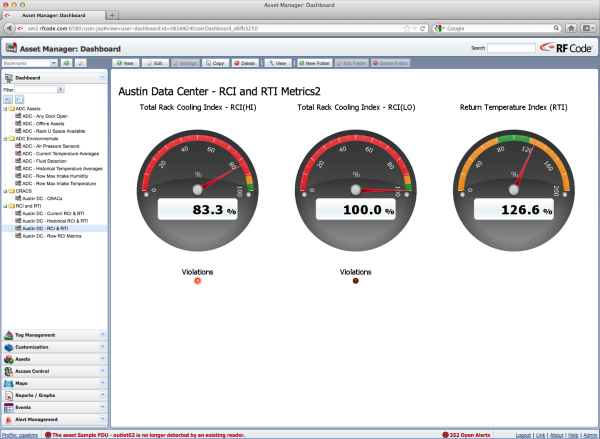 In Figure 7, the Total Rack Cooling Index – RCIHi and Total Rack Cooling Index – RCILO are summary or roll-up values for the entire data center side-by-side with the Return Temperature Index metric. This is another example of an extremely useful and powerful view for a data center NOC providing real-time visual indicators of data center thermal performance.
The RCI and RTI metrics are powerful, useful and informative especially when they are computed in real-time using fine-grained sensors providing live data feeds. However, just as important as the actual value of these metrics is how the information is conveyed to the data center operator. How valuable information is presented (or not presented) has a measurable impact on how operators interpret and act on that information. Visual presentation and changes in that visual presentation can drive behavior.
Gone are the days of the cold data center where the temperature is constant 62 degrees. Data center operators are being driven to cut costs - especially energy costs by optimizing cooling vs. energy dollars spent. However optimization can’t be accomplished in blindly. Real, fine-grained data must be obtained, analyzed, and utilized to drive the correct optimization actions. You can’t optimize what you don’t measure and you can’t measure what you don’t monitor.
Rack Cooling Index (RCI) is a Registered Trademark and Return Temperature Index (RTI) is a Trademark of ANCIS Incorporated. (www.ancis.us). All rights reserved. Used under authorization.
